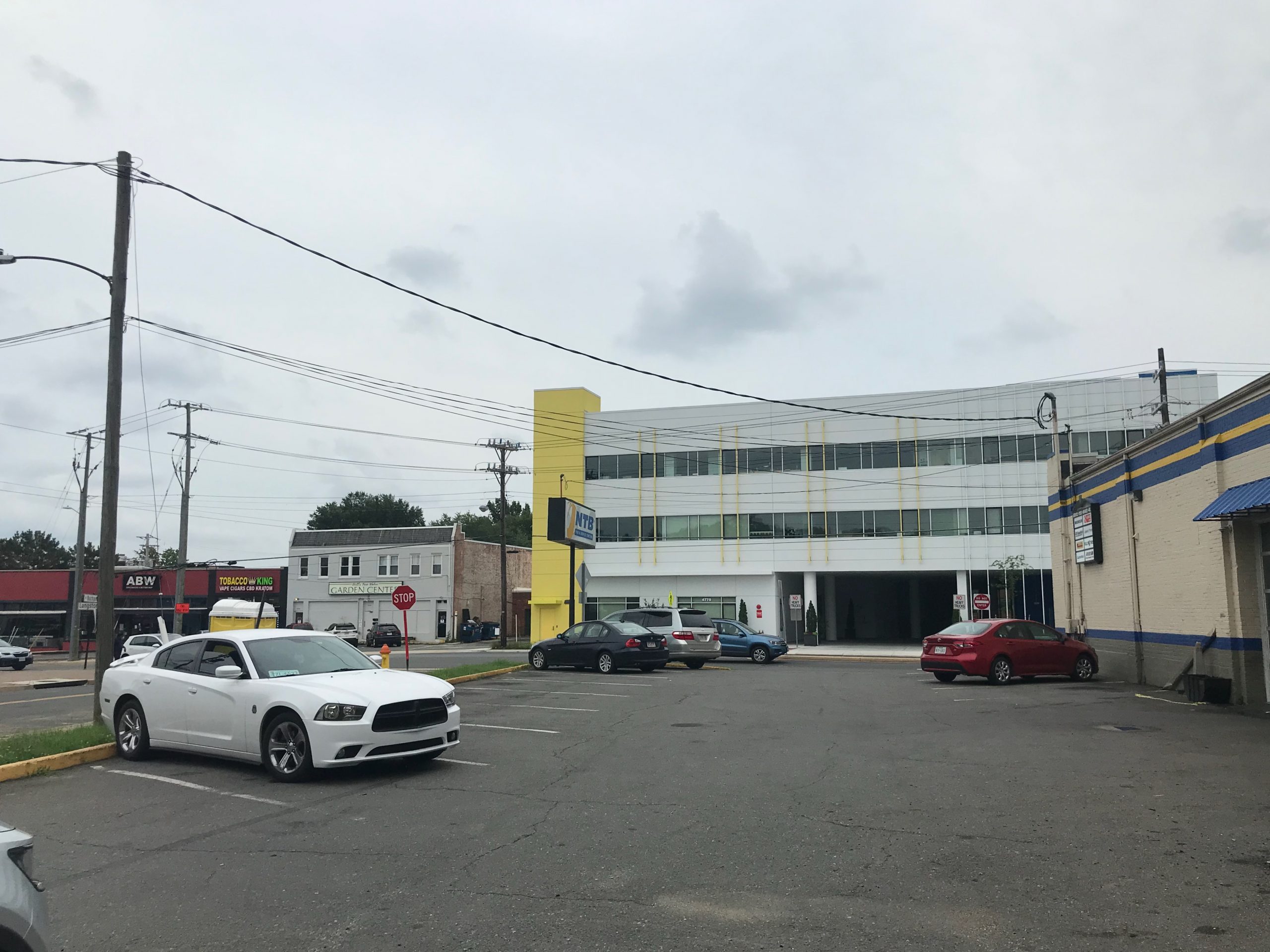
Since the yellow paint matches the NTB, and the porta-potty, and the Tobacco King, I suppose we can say the building responds to its context.
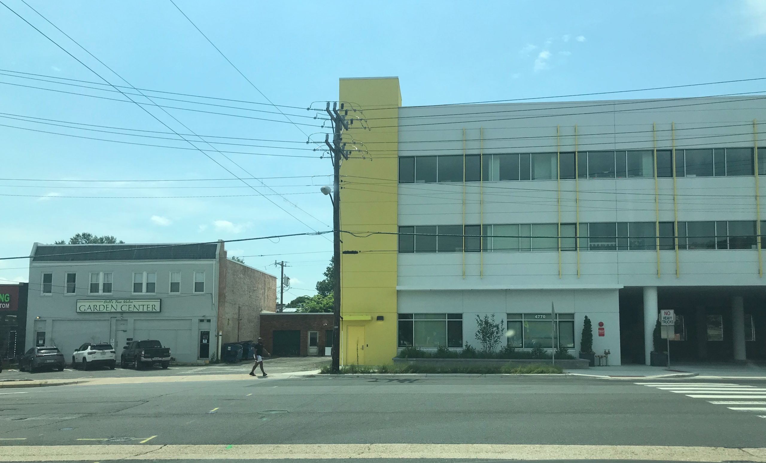
Human figure added for scale.
Avert your eyes: why is it so much more rewarding to look at the sky than almost the entire foreground?
“It”s a daycare center!”
“It’s an office building!”
“It’s a daycare center!”
“No, it’s an office building!”
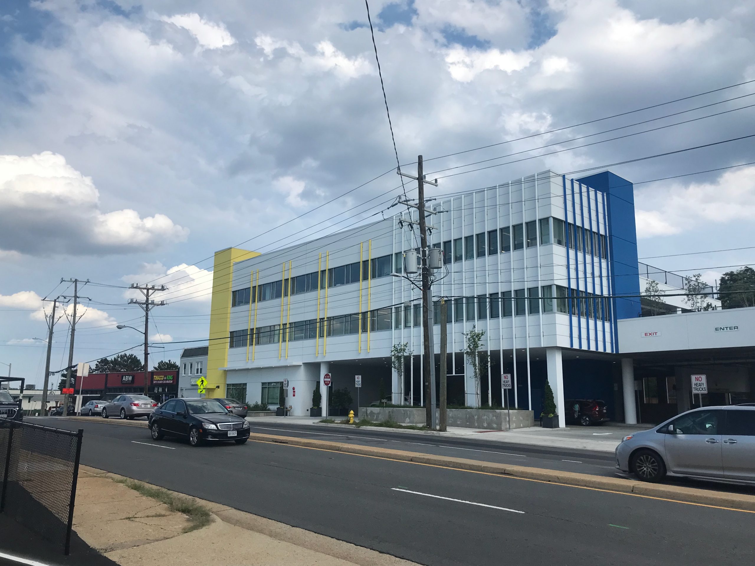
“Hey I know– let’s use bright cheery colors!”
“Yellow!”
“Then everybody wins!”
“Yay!”
Every building presents not just an opportunity, but an obligation, if not a moral imperative, to add beauty to the world.
This building was a public-private partnership so it took a lot of people to fail to rise to that charge on a large scale.
This thing will aggravate our eyes for thirty years only to be torn down, its components sent to a landfill, and replaced by another (even worse?) eyesore.
Meanwhile, Arlington can’t be bothered to bury our power lines. Take another look at those photos.
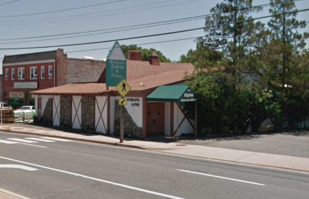
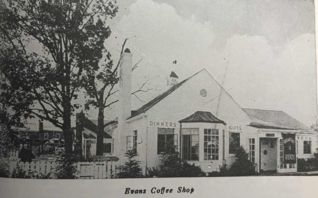
Just to remind you what the property looked like three years ago:
Beautiful? No. Ugly? Eh. Eye of the beholder. But not RAMROD IN YOUR FACE WE HATE YOU HUMAN UGLY.
You may not realize that it started life like this: